Brand · Country
Brand · Country

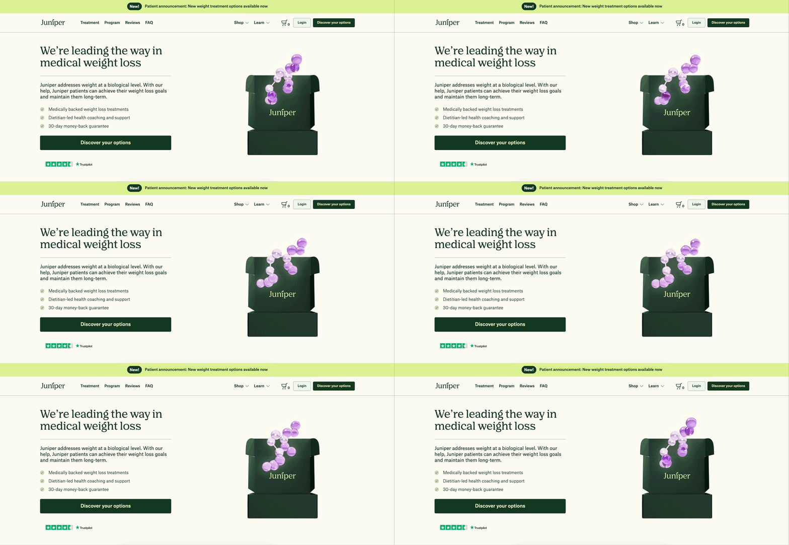
Juniper’s Weight Medication Landing Page Experiment

Juniper’s Weight Medication Landing Page Experiment

Juniper’s Weight Medication Landing Page Experiment

This is one of the top-performing pages in terms of conversions. However, we identified that certain areas, particularly the middle sections, could be refined to improve engagement and reduce drop-offs, especially on mobile. Our challenge was to enhance user engagement and conversions (quiz start) while maintaining the page’s core strengths.

This is one of the top-performing pages in terms of conversions. However, we identified that certain areas, particularly the middle sections, could be refined to improve engagement and reduce drop-offs, especially on mobile. Our challenge was to enhance user engagement and conversions (quiz start) while maintaining the page’s core strengths.

The Goal

The Goal

Our goal was to increase the conversion rate on the Weight Medication Landing Page by making it more engaging and user-friendly, particularly in areas where drop-offs were observed.

Hypothesis

Hypothesis

A redesigned variant of the landing page featuring new panels, simplified copy, and clearer visuals would lead to higher user engagement and improved conversions by:

  • Offering more context and support to users,

  • Improving clarity through cleaner visuals and copy.

User Research

User Research

We conducted informal user interviews within the company to gauge how existing users interacted with the page and understand what information they valued most. Users indicated they appreciated straightforward, concise messaging and visuals but sometimes felt overwhelmed by dense content in the middle of the page.

Here are a few notes we got from our colleagues outside the Juniper team:

QUESTION
QUESTION
Why do you think the landing page is effective?
ANSWERS
ANSWERS
  • Three high-level pieces of information: Trust, program inclusions, and evidence (B&As) are crucial for the first three panels of the landing page.

  • Trustpilot widget is shown before the visuals in the hero section.

  • Holistic and approachable.

  • Social proof: Program inclusions and evidence of working with other people.

  • Three high-level pieces of information: Trust, program inclusions, and evidence (B&As) are crucial for the first three panels of the landing page.

  • Trustpilot widget is shown before the visuals in the hero section.

  • Holistic and approachable.

  • Social proof: Program inclusions and evidence of working with other people.

  • Three high-level pieces of information: Trust, program inclusions, and evidence (B&As) are crucial for the first three panels of the landing page.

  • Trustpilot widget is shown before the visuals in the hero section.

  • Holistic and approachable.

  • Social proof: Program inclusions and evidence of working with other people.

QUESTION
QUESTION
What elements can be improved?
ANSWERS
ANSWERS
  • “Take the quiz” feels broad. Users have to go through obstacles before getting an answer, and may be unsure if they're eligible for the program.

  • Video is most likely not to be clicked or watched. It feels too long and doesn't provide enough context about what the video is about.

  • Page length. Regular users may not scroll all the way to the bottom of the page.

  • Instead of showing the actual Juniper boxes, replace them with the brown box, as discretion is a big consideration.

  • “Medically backed treatment” is repeated in the hero section and could be replaced with a different message.

  • Move Trustpilot reviews higher up on the landing page and combine them with B&As/social proof to encourage people to convert.

Competitor Analysis

Competitor Analysis

Looking at competitors, we noticed:

  • Easy-to-follow CTAs that guided users step by step and a shorter quiz for eligibility.

  • Simple, clean designs with fewer distractions.

  • Content split into smaller, easy-to-read sections instead of overwhelming users with too much at once.

These findings helped us improve our CTAs and organize content to make it clearer and easier to navigate.

Section title

Section title

I looked at how other paediatric and healthcare brands communicate with parents, particularly how they structure information and guide people through the journey.

Brightline stood out for its direct, emotionally aware approach. This helped shape how I approached the content and structure of the new site. Keeping things simple, easy to scan and focused on what parents actually need to know.

I looked at how other paediatric and healthcare brands communicate with parents, particularly how they structure information and guide people through the journey.

Brightline stood out for its direct, emotionally aware approach. This helped shape how I approached the content and structure of the new site. Keeping things simple, easy to scan and focused on what parents actually need to know.

Section title

Section title

  1. Show the care, not just the clinic. The old homepage relied heavily on individual staff and clinic imagery. I brought real therapy footage into the hero to give parents an immediate sense of what the experience looks like.

  1. Show the care, not just the clinic. The old homepage relied heavily on individual staff and clinic imagery. I brought real therapy footage into the hero to give parents an immediate sense of what the experience looks like.

  1. Help parents find the right service. Rather than simply listing the three services, I gave each one a short explanation and a clear path to learn more.

  1. Help parents find the right service. Rather than simply listing the three services, I gave each one a short explanation and a clear path to learn more.

  1. Make the process feel less overwhelming. Starting therapy can feel like a lot for a parent who doesn't know what to expect. I introduced a simple step-by-step section to explain the journey from the initial conversation through to ongoing therapy.

  1. Make the process feel less overwhelming. Starting therapy can feel like a lot for a parent who doesn't know what to expect. I introduced a simple step-by-step section to explain the journey from the initial conversation through to ongoing therapy.

  1. Give parents a clearer next step. I also introduced clearer calls to action throughout the site, giving users a more obvious next step as they move through the site, whether they're still exploring services or ready to make a referral.

  1. Give parents a clearer next step. I also introduced clearer calls to action throughout the site, giving users a more obvious next step as they move through the site, whether they're still exploring services or ready to make a referral.

Before and after: Homepage design

Key learnings

Key learnings

  • Less content, more clarity. For anxious parents, cutting copy back to what matters did more for trust than adding detail. Simplicity was a deliberate design decision, not a shortcut.

  • Lead with what's real. Putting actual therapy footage up front did the heavy lifting for trust. That meant stock could support the story without carrying it. Next time I'd push for a dedicated shoot early, so the content library supports the design rather than limits it.

  • Align early to move fast. Locking in decisions with the team upfront is what made a tight launch date achievable.

  • Design for what's next. Building with expansion in mind meant thinking in reusable templates and patterns, not just pages for one clinic.

  • Less content, more clarity. For anxious parents, cutting copy back to what matters did more for trust than adding detail. Simplicity was a deliberate design decision, not a shortcut.

  • Lead with what's real. Putting actual therapy footage up front did the heavy lifting for trust. That meant stock could support the story without carrying it. Next time I'd push for a dedicated shoot early, so the content library supports the design rather than limits it.

  • Align early to move fast. Locking in decisions with the team upfront is what made a tight launch date achievable.

  • Design for what's next. Building with expansion in mind meant thinking in reusable templates and patterns, not just pages for one clinic.

Section title

Section title

The new website launched alongside the Allied Kids Therapy rebrand, giving the new brand a clearer digital presence and a more straightforward experience for parents.

The new structure also created reusable foundations that could support future services and clinic expansion.

Post-launch conversion data wasn't available, so I haven't included a measured business outcome for this project.

The new website launched alongside the Allied Kids Therapy rebrand, giving the new brand a clearer digital presence and a more straightforward experience for parents.

The new structure also created reusable foundations that could support future services and clinic expansion.

Post-launch conversion data wasn't available, so I haven't included a measured business outcome for this project.